Logos / Branding
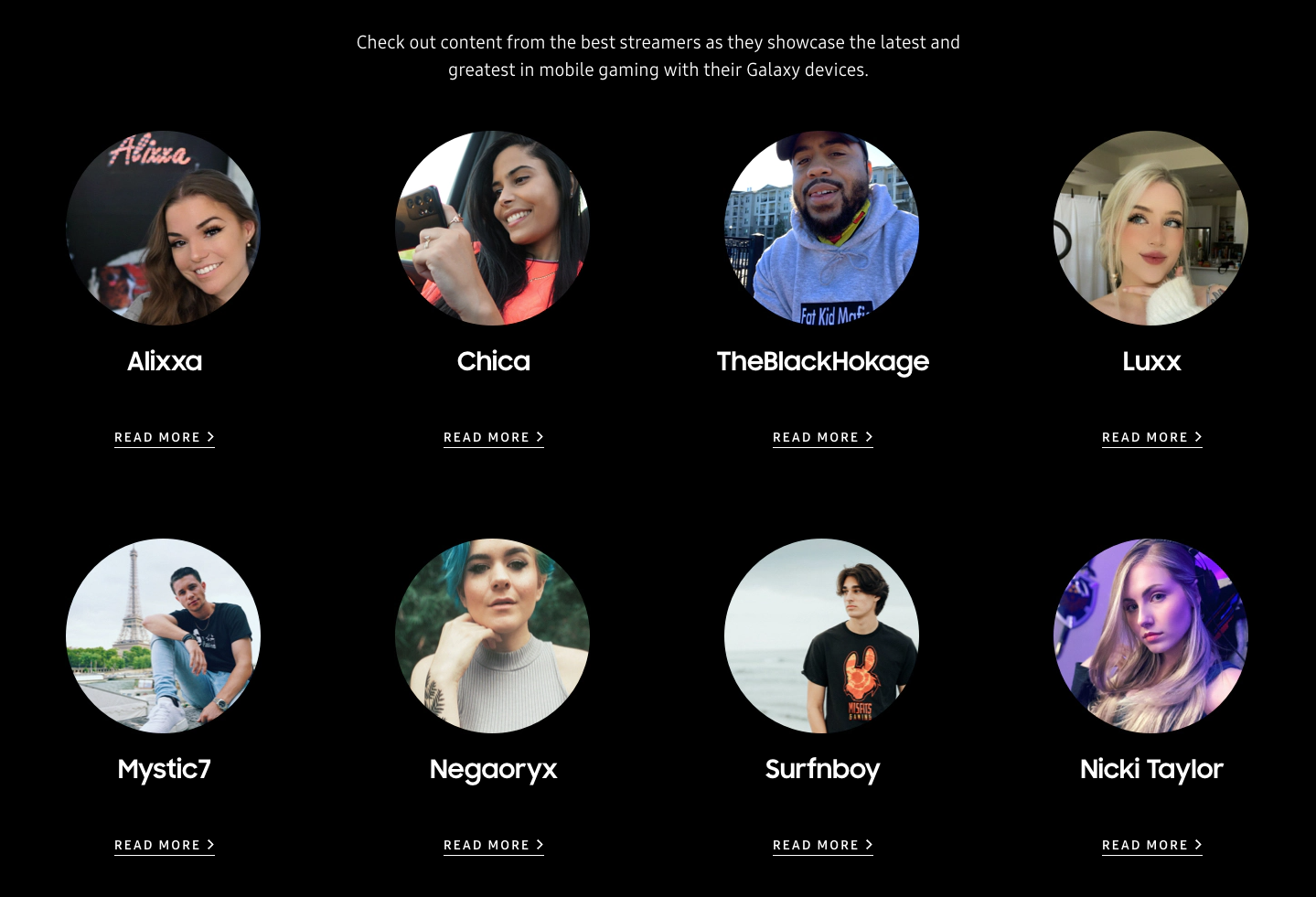
Mobile Heroes is essentially a brand awareness project in which Twitch streamers are part of a team sponsored by Samsung to showcase their devices in action, while streaming mobile game play. This logo is displayed on the Twitch streamer’s bio page as well as in-game during featured streams of gameplay.
With a current roster of 8 influencers and combined number of subscribers above 1 million, it was extremely important to capture the Twitch aesthetic. After some much needed twitch research, I went with this stylized chrome graphic.
Alixxa’s Twitch stream screenshot showing the logo placement during gaming live stream.
Mobile Heroes team members
BlackHokage info page
Beacon Advertising
Final Wordmark
It was pretty cool to show up to work one day and see the logo you created was installed on the front door.
Beacon Advertising is a Texas agency with a no-nonsense approach to servicing their clients.
As the agency-client structure has shifted to a much faster paced model, it was important to leadership that we change our branding and stand out from the field of competitors. “We’re not about jargon, we’re not about distractions and we’re not about ourselves. We’re only about your success. Nothing Artificial.”
Creating this bold and simplistic logo was a challenge. It began as a competition of sorts within the creative team. Through many, many rounds of revisions a creative review sessions (I thought clients were nit-picky!) one of my finalists was chosen. The idea evolved through countless tweaks and the I think the end result reflects this refinement. The use of a closely spaced, bold serif typeface with rounded edges was intended to stand out as something different.
The wordmark and lettermark are punctuated with a period to show that not only is Beacon a guiding light but also a top-notch agency, period.
Options for stationery.
92.9 KUZU FM / Denton, TX
KUZU is a non-profit community radio station in Denton, TX. Since their meager beginnings in 2017, I have been contributing designs for promotional items and this logo has become one of the more recognizable brand marks they have used since. It’s a fun project to be involved with and seeing some of the work I have made for them reminds me it’s time to make more!
Some “retro” bumper sticker designs given as gifts to pledge donators.
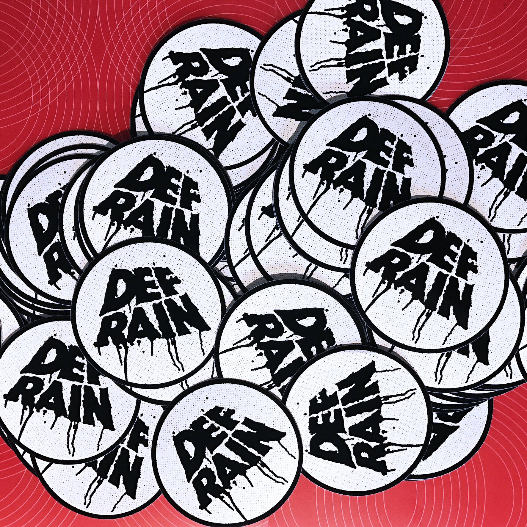
Mostly Def Rain Stickers!
Various band logos for stickers & tee shirts.
Text treatment / logo for a theatre production.
This band wanted a logo styled after one of the greatest analog delay pedals of all time – The Electo-Harmonix Deluxe Memory Man!
Taco Cabana
These Taco Cabana treatments were made for specific social media daily special offers.
Mobile Heroes team members
BlackHokage info page
Misc logo work
Revel is a small startup contractor out of Bald Head island, NC. This sleepy beach town’s most notable landmark is the lighthouse and incorporated the local sea grass to invoke a feel for that coastal breeze.
A range of options were created in from more traditional, somewhat generic to somewhat abstracted concepts gathered from the initial meeting with the client. Although what I created was not chosen, it was a nice exercise in responding to initial client direction.
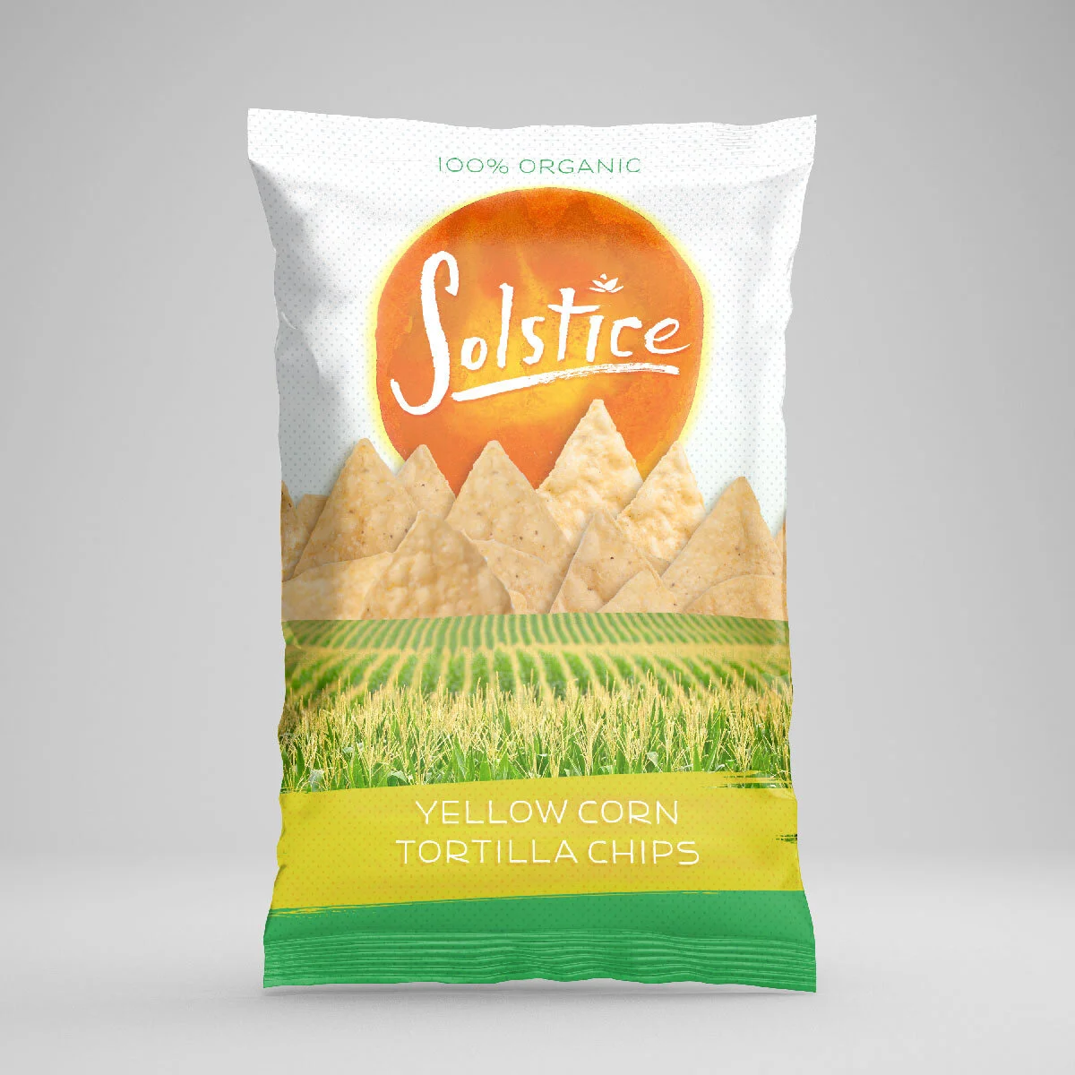
Truco foods put Beacon to the task of concepting several products, primarily their tortilla chip brands. I included a concept for an organic chip brand with a hand drawn logo and a lockup for On The Border brand chips. This was great fun using watercolor and india ink and slighty manipulate digitally to acquire a different feel. I think the brushed look spoke to the “natural” and “organic” product in a nice way.


